Monday, November 16, 2015

Do Warm Novembers Lead To Warm Decembers?

Our November forecast was for above normal temperatures.  Through the 16th (eventually through the 18th) it will verify quite nicely.  But do these warm temperatures across much of the US mean that december will be warmer than normal?  Not necessarily. I found the warmest FIRST HALF NOVEMBERS in northern Ohio and charted below the Decembers that followed.

Notice that each December is a bit different.


The bottom line is you cannot use a few weeks in early November as the only predictor of the month or winter ahead. 

Look what happened last winter. Each box shows the temperature across the country for each month left to right starting in November and ending in February.  I guarantee that most people were thinking these thoughts after each month:


Tuesday, November 10, 2015

I Need Your Input/Ideas


It's been almost 10 years since I started my weather blog SCOTT'S WORLD OF WEATHER. Back in late 2005, it was a more general blog about my observations of the world as a new father coupled with some random science and weather. About 5 years into it, my focus shifted to the technical side of weather, atmospheric science, forecasting and our perceptions/biases of both. It slowly became a diary of my thoughts about these technical subjects which, by their nature can, and have become self-indulgent to a certain degree. The last thing I want is to be so far drawn into a subject technically that the narrative I'm trying to convey becomes thickly bloated with esoteric terms and convoluted analysis. The last thing I want to do is lose people.

As a result, I believe many posts have lost sight of what the reader really wants.  So I'm asking everyone who reads my blog what they would like me to cover and how they would like it done. Let me know what you like, what you don't. Let me know what was too hard to understand.  Please let me know in the comment section below. Do you want more explanations,less explanations? Pictures? While I can't promise that each blog post will be clean and simplified for every one's taste (after all, the world of science is a very complex place), I will work on explaining each element a bit better.

Send me your comments at the bottom of this page or at the following locations:

Via email:  scott.sabol@fox8.com
Facebook:  http://facebook.com/scottsabolfanpage
Twitter:  scottsabolfox8
Instagram:  scottsabolpics

YOUR FEEDBACK IS WELCOME.

In advance, thank you!

Tuesday, October 27, 2015

El Nino Update: 1997 vs 2015

I plotted the weekly sea surface temperature anomalies starting in early June for the ENSO 1.2 region (closest to the South American coastline).


 Notice how 2015 is running cooler versus the 1997 event. Another component into our winter weather outlook which airs this Thursday at 6PM on FOX8!


Thursday, October 22, 2015

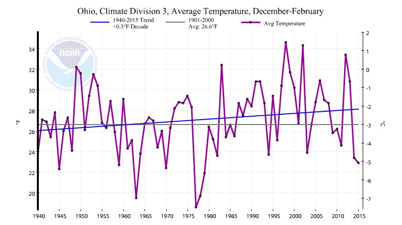
Winter Temperature Trends in Ohio (Midwest)


The National Climate Data Center has a great site for graphing the many climate divisions and climate regions across the U.S. So I plotted the winter (December through February) average temperature trends for various regions around northern Ohio since 1940. I chose 1940 because prior to the late 1930s, the official NWS temperature reading was taken at various locations throughout the Cleveland area. Since 1940, Hopkins Airport has served as the official NWS temperature location.

Notice the very cold winters of the early 1960s, late 1970s, highly variable winters of the 1990s and early 2000s and the last two cold winters at the far right side of the graph.

Overall, the trends are similar with each graph showing winter temperatures more consistently above average since the early 1980s. The overall warming trend however amounts to a tenth to a few tenths of a degree per decade in Cleveland and surrounding climate divisions and outside regions.

Note: My only aim is to show the past winter temperatures (December through February) with NCDC data. Nothing more. Nothing less.

ENTIRE STATE OF OHIO


 Ohio climate divisions:


NORTHEAST OHIO
NORTH CENTRAL OHIO
 
MANSFIELD, ASHLAND REGION


CORNBELT


OHIO VALLEY: OH, IN, IL, MO, KY, TN, WV


Friday, October 16, 2015

Precipitation and El Ninos: West Coast Rains Not Always A Lock


Not all El Ninos are alike. We've heard this time and time again. Sea surface temperatures are never exactly alike. Jet stream position varies. Overall winter temperatures vary too as does the location of above and below normal precipitation. We remember the El Nino of 1997-98 that produced heavy rains out west.  But that's not always the case.

We examine the top El Ninos according to the ONI Index from this site. We only examined the El Ninos that are ranked MODERATE, STRONG AND VERY STRONG.

THE STRONGEST EL NINOS (1997-98 and 1982-83)  

Storm track kept heaviest precipitation along the west coast and in the southeast.  At or below normal precipitation around the Great Lakes.


STRONG EL NINOS - RANK #3, #4 AND #5

Storm track is still strong in the deep south with a southerly shift out over the Gulf of Mexico with above normal precipitation.  Aside from the winter of 1957-58, precipitation along the west coast is less in these years. Still below normal precipitation across much of the Great Lakes.


MODERATE EL NINOS

Southern storm track is still strong but weaker during the winters of 1986-87 and 1963-64. Storm track shifted much further north into the Ohio Valley and Mid-Atlantic during the winters of 2002-03 and 2009-10 with heavy wet snows. During many of these winter, well below normal precipitation was observed along the west coast especially during the winter of 1963-64


Contrary to what you hear, its not a guarantee that El Ninos always produce heavy precipitation events across the west coast and the Pacific Northwest. It does appear that the chances are greater with stronger El Ninos per the ONI Index.  The southern storm track seems to be more consistent--with varying intensities--in each of top El Ninos. 

============================================

A few side notes:

* Another modulator of the El Nino and storm track is the mode of the PDO (Pacific Multidecadal Oscillation). The winters of 1957-58, 86-87, 87-88, 97-98, 2002-03 and this year so far all have PDO values strongly positive.

* Yet another area of the Pacific that may have ties to the evolution of El Nino is the Pacific Meridional Mode located between the equator and Baja California. The link between the two is being studied. Here is a paper published in 2014.  Looking at the data from late summer through fall during early El Ninos, late 1957, 1986, 2009, 2015 (and partly 1982 although it was trending cooler) all had positive values (above normal water temperatures).

Do we see some matches above for this winter?  Hmmmm.


Wednesday, October 07, 2015

Northern Most Hurricane EVER!

Hurricane Joaquin is still churning out in the open Atlantic more than 14 days since it become a tropical depression on September 28th in the Caribbean.


The official track from the NHC has it sustaining tropical characteristics through the upcoming weekend as it tracks as it approaches Europe.


This had me wondering what the furthest NORTH any hurricane has traveled. The award goes to Hurricane Faith in 1966. This system started out off the coast of western Africa, headed toward the Caribbean then north off the coast of the U.S. then out to sea. It lasted 26 days and traveled more than 6800 miles. 


What I find fascinating is that according to the official track data (wind, position and date) it held hurricane strength over incredibly cold water. The hurricane crossed into water below 20 degrees Celsius off the coast of Nova Scotia yet it stayed at category 2 strength for another two and a half days.

WATER TEMPERATURE IN CELSIUS
The storm didn't officially weaken until it reached the north of Great Britain where the water temperatures dropped to between 10 and 12 degrees Celsius. The "X" marks the approximate location where Hurricane faith was downgraded to a tropical storm....yet it continued as an extra tropical storm/low into Scandinavia for another week!


The National Hurricane Center has a great summary on the hurricane season that year. They show a  map of Faith denoting its movement into the arctic north of the Arctic Circle into the Soviet Union then north into the Barents Sea where water temperatures were barely above freezing.

Air temperatures were in the 30s and 40s.


It finally ended its journey over an uninhabited island chain north of the Arctic Circle around 600 miles from the North Pole.


Monday, October 05, 2015

How Many Gallons of Water Fell over Parts of South Carolina?

Photo Courtesy: CNN.com
Some are calling this rain event a "Thousand Year Rain Event".


Many locations have received more than 20" of rain since Friday.  The final rainfall totals map here as of Tuesday 5:30am.


The National Weather Service office in Columbia, South Carolina has a great summary HERE. Eyeballing this map shows roughly seven counties with at least 15" across at least 90% of each county as of Sunday evening.


So how much rain in gallons is 15"?  A quick volume calculation will give us the answer: The area of the 7 county region (Richland, Sumter, Clarendon, Williamsburg, Berkeley, Calhoun and half of Charleston counties) is 10,317 square miles. Convert 15 inches into miles and you get 0.000237 miles. Multiply these together you get 2.44 cubic miles. Convert cubic miles into gallons and the answer is:

2,690,000,000,000 gallons (trillion)! 

This is DOUBLE the volume of Lake Okeechobee in Florida.

So image dumping Lake Okeechobee TWICE over these 7 counties over a 3 days period!

Wednesday, September 30, 2015

Human Nature and the Uncertainty in this Weekend Forecast

A hurricane off the east coast, strong cold front, gulf moisture, Atlantic moisture. These are just a few of the factors that will drive the rain and wind this weekend. In my opinion, one of the most difficult forecasts in recent memory.


The various computer projections are taking Hurricane Joaquin and the other tropical disturbances in all sorts of directions as it begins its interaction with the other variables above. Each line represents a different computer model representation of each outcome.  Are you confused yet? 


Our minds don't easily handle probability. We especially hate probabilities in our weather forecasts especially when confronted with a map like this.

Why is this?

For our minds to grasp probabilities, we need to be able to handle multiple possible outcomes at once. Just our luck. Weather has many, many outcomes over a large area over a significant period of time. Change the initial weather conditions (humidity, wind flow, frontal position, upper level energy, etc) and you create more uncertainty. Factor in time and the probability becomes significantly higher.

Typically, our brains work much better with a theme that is linear: A story that has a beginning, middle and an end. We want to visualize a line of showers that moves in at a specific time, stays for a select amount of time and then moves out without fanfare. Unfortunately, rain events rarely behave in this manner.

Much to the chagrin of the general public—probabilities are the only way to tell the weather story. We use 90% chance of rain, 40% chance of rain, etc. Yet if it doesn't rain over their house when the probability is 90% chance of rain, the forecaster is wrong even if the rest of the area was hit with a good downpour. We want to know if it will rain or not; a black and white scenario without caveats. Yet the behavior of some small scale weather events like warm frontal rain/storms can behave semi-independently of the overall large scale pattern. Meteorologist try to convey this idea on the air. Most of the time this falls on deaf ears.

It all goes back to basic human nature. A good weather narrative (a feel-good forecast with some folklore) is desired versus something data/science driven. Nebulous weather data and science makes most of us feel uncomfortable even if the on-air meteorologist has the best of intentions.

In recent years,  some highly sophisticated models of the atmosphere have been developed that can make some very good “probabilistic” outcomes for weather events. Yet a level of uncertainty still remains and we humans don’t like it!  We try to rationalize the irrational. Our biases quickly dismiss the probabilistic science as irrelevant or at the very worst, an excuse.

Instead, we favor more simplified stories even though that story might gloss over important details. Our minds involuntarily cherry-pick elements of the story so that it fits our biases. Think of a time when someone told you a weather fact or forecast which you didn’t believe. You felt uneasy. Your mind shrugged it aside only to be replaced by a story, forecast or explanation that made you feel better…accuracy be damned.

* Narratives (straight forward simple weather forecasts) are about hitting emotional buttons making the reader feel good by focusing on less qualitative aspects (weather science and probability) of an issue.

* Narratives (weather forecast) are/is about the outcome not the process (explanation of the science and probability)

* The process (weather science) is important in developing solid results

So remember the psychology. How you react when you hear a weather forecast?  Do you dismiss the science? How do you handle probability?  Do you like hearing an explanation to why the weather does what it does? Do you overly simplify the weather? Are you aware of your biases?