Wednesday, December 07, 2022

Below Zero Wind Chill History: What Years Experienced More?


It's been two years since I updated this chart.  It shows total hours at each below zero level from last winter (2021-2022) back to the winter of 1976-1977.

Here are some take home points: 

*  No -20 wind chill since early 2019

*  Coldest winter (wind chill) in recent memory was 2013-14.  Also the last time we had a long duration period with wind chills under -30

* Winter of 1992-1993 was the only one without a wind chill below zero. 1997-98 was close.

* Some notable winters (total hours below zero):  

2018-19:  669

2017-18:  842

2008-09:  772

1996-97:  1022

1993-94:  1605

1989-90:  1089

1983-84:  1958

1976-77:  2125


Friday, October 28, 2022

How Do Meteorologists Define Precipitation Chances? Part 2


Part 1 of the Precipitation Percentage topic talked about the technical definition and my definition and usage.  What about on-air meteorologists?  How do they define precipitation percentage?  How do they come up their number for their forecast? Do they even use percentages?  Here are some answers from on-air meteorologists across the country?

  • "I actually don't include percentages in my forecasts as I feel they can be confusing to the audience. My understanding of them as issued by the NWS is that percentage od the forecast area would receive any precip."

  • "On our 12 hour planners the pops are specific to the city of choice. On the 7 day its the pops for our viewing area."

  • "There's an art to this, it seems, but like NOAA, we use coverage and confidence as our main factors in determining POPs for our zones. I tell our customers, "You should expect to cross with rain at least six of every ten times you hear us forecast a '60% chance of rain'."

  • "My working definition for precipitation percentages is the percent of my viewing that will see rain. So, if the rain chance is 70%, then about 70% of the viewing area would see rain and about 30% of the DMA would not. However, if that 70% sees rain, then there is a 100% chance of rain for them.  I typically used MOS guidance to help me out a bit on rainfall percentage. I also just use model guidance and common sense, especially if I’ve seen a similar weather pattern on the models or maps. Sometimes the models will say it’s a big chance, but other variables keep the chance down....confidence plays a huge role in choosing POPs. I want was much information as I can to make the best forecast I can with precip. I do also believe that rainfall intensity sometimes does play a factor. If I see potential for heavy rain, that will affect my decision making. Also, the major counties or cities in our DMA. If there is a better bet for rain in those location, I have, at times, adjusted the forecast to reflect the population center of our viewing area."

  • "I fill out a spreadsheet with all the model data to get an analytical view of the numbers. That has high/low/PoPs to compare and see trends from day to day. Also helps to compare anomalies with models that are trending drier/wetter/colder/hotter than the rest."

  • "We don't use POPs on-air, or convey rain as a percentage on our forecasts. However, we do use "isolated" "few", "scattered", and "widespread" to describe rain coverage."

  • "We use POPs as defined by confidence in the forecast times and the coverage of the rainfall. While we use this traditional method in calculating the POP we do tailor them more to the audience as strictly the chance of seeing rain for the forecast area."

  • "We don't use pops on air because of the confusion you're likely looking to highlight.  We use words to qualify precipitation placement and likelihood.  There is a bit of POPs in the making of that, though.  Main variables being coverage and confidence of at least .01" rain in our area... Oh... also, we use coverage * confidence for a given time period."

  • "PoP to me is the percent of the populated area that will get rained on at some point during the forecast period. I know that is not technically right. But it works."

  • "...Percent chance of any one location seeing precipitation during the stated time period. Not areal coverage or duration. We show precipitation icons for any PoP 30% and above and do not use 10% in daily forecasts (we do in hourly forecasts). We do not use 50% for either daily or hourly forecasts as it invites “forecast skeptics” to make “50/50 guess”-type comments."

  • "I use it as a general number for chance of rain in our averaged area as a whole. It's tough to do broadly for a whole forecast area right? Since it's really more useful for a specific point."

  • "For instance I may put 50% chance of rain on a graphic, even knowing the chance is 10% on a specific city and 85% in Central parts of the state. You have to eyeball it a little...then explain further in your forecast who's actually most likely?"

What Does Percentage of Precip Actually Mean? Part 1

What does the Percentage of Precipitation actually mean on a weather forecast?  


Does it mean we'll receive rain 40% of the time, 40% of the area?  If there’s a 30% chance that it will rain, then is there a 70% chance that it won’t rain?

Or is it something else entirely?

It's one of the most commonly asked questions of meteorologists.  Everyone seems to have their own definition. Is there a standard?  

The technical definition below is taken from the NWS:  (Link here)

"the probability of precipitation is simply a statistical probability of 0.01" inch of more of precipitation at a given area in the given forecast area in the time period specified"

This is calculated by multiplying two numbers:  Forecaster confidence (Percentage) and Areal Coverage.  So if the forecaster is very confident (90%) that rain will develop but only 30% of the area in question will receive the rain, then the final precipitation probability would be: 

Percentage of Precip. = 0.90 x  0.30

Percentage of Precip =  0.27  Rounded up to 0.30 or 30%

Got it?  😮

Here's what it doesn't mean:   "If there’s a 30% chance that it will rain, then there a 70% chance that it won’t rain."

It also doesn't factor in:  How long it will rain,  How much precipitation,  Intensity of the rain/precipitation  

Summary from the NWS

This can get confusing. Plus it's hard to visualize for the lay person nor is it practical.  

The other more non-technical way is defining precipitation percentages as the amount of the region--overall coverage--that will see precipitation over a certain time frame.  This is a great benefit to an on-air meteorologist who needs to cover dozens of counties over several minutes. A generalized map can work IF the weather event is more large scale like widespread showers with no breaks.

January 2019 winter storm

The image below gives the higher likelihood (brighter green colors), time of precipitation and other useful information about duration and intensity.  All useable and relatable information for the viewer.


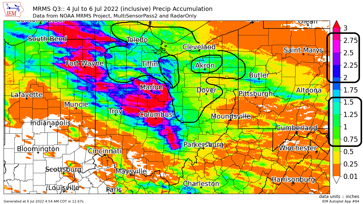
The problem with this generalization arises when precipitation is heavy in one location and/or spotty in another. The forecast details become highly localized. Here is an example from our first snow on November 15, 2021. The shoreline was pounded with heavy lake effect snow.  Inland hardly any precipitation with sunshine. One number doesn't work in this case.


A generalized map in this case becomes unrelatable because most viewers don't necessarily care what's happening 50 miles away unless it impacts their lives in some way.  Attempting to give a percentage for each location taking into account the numerous dry periods and pockets is just not practical for the on-air meteorologist. The conditions in this example change too fast. 

Here's another example of a line of storms moving across northern Ohio at 7:21PM on October 23, 2020. Viewers impacted by the storms in Lorain county or near Mansfield would interpret the forecast as 100% chance of rain.  Yet people in Akron or Canton would guess 0% given the lack of rain at this point. Yet another example of how ONE PERCENTAGE NUMBER doesn't even begin to tell the complete weather forecast story.


How about the extended forecast? The 5,7 or 8-day forecast that you see on television or a weather app utilizes a percentage. It's been a staple and weather forecasts for a very long time. But often times they lack context and qualifying information similar to the graphic above to make the number useful. We at WJW FOX 8 add some basic text but that too has limitations. 


On air meteorologists have time against them. They have a small amount of time (usually under 2 minutes) to deliver quality, usable information to the viewer. They need to do this in such a way that addresses as much of the viewing area as possible. For the Cleveland market it encompasses 25 counties and roughly 8000 square miles. 


Unfortunately, one percentage number doesn't do the forecast justice.  It lacks context. It lacks specificity.  So how do we get around this? What's the solution?

Unfortunately there is no cut and dry answer.  For me, I believe the beginning of any workable answer lies first in basic psychology and perception. That is we must always remember that most people visualize the weather through their own spatial filter.  They visualize the weather conditions or forecast through what we can see literally in our own backyard, where we work or live. Their weather universe is what we can see. If that percentage is describing something outside of their event horizon, it's irrelevant. How many times have you looked out the window, saw the weather, made an assessment and determined your daily activities only based upon that?  We all do it.  

For on-air meteorologists in my view, we need to take this viewer centered, subjective view of the weather into account.  How do we do this?  

I have my own subjective definition of what precipitation percentage defines. For me it's a combination of three elements:  I call it the "THE THREE C's".

CONFIDENCE

COVERAGE

CRITICAL

CONFIDENCE, as mentioned earlier is subjective with each forecaster. This is based upon the forecasters expert analysis of the situation. On the extended forecast I rarely put a 50% or higher further out than 5 days because the confidence is so low in most instances (see graphic below)

COVERAGE is what portion and how much of the viewing area will receive precipitation. Pretty self explanatory.  See earlier image.

CRITICAL is accessing what elements are the most important and how they impact the viewer. For me this is the meat and potatoes of the entire forecast!  

How intense is the precipitation?  How long and how hard will it rain or snow?  When is this occurring?  How will this impact the viewer? How many will be impacted?  I factor these into the overall weather setup and weight them.  Is this occurring for the first time in the season or has this been a reoccurring event? 

For example if the rain will be light and last only a brief time at midnight where it impacts only a small amount of people then I weight the precipitation event less than if it was going to downpour over an hour at rush hour.  If we anticipate a foot of heavy wet snow to fall as kids head to school in November, this will be weighted more significantly than if it was an inch of snow in February (public perception).  Some of what's Critical as defined here is quantifiable.  Some are not. 

I take into account as much information from the "THREE Cs" as possible and come up with a number in the form of a percentage that best fits the weather scenario.  It's taken me years to learn how to do this.  I've trained myself to complete this exercise each day almost subconsciously as I assess the weather forecast specifics.  

So on my graphics the percentage you see is my best interpretation of the "THREE Cs"

Example from December 19, 2022


Monday, October 10, 2022

MLB 2022 Recap - Were There Any Significant Changes?


Here are numerous charts showing where the 2022 MLB season compares to recent seasons. 

All data is from Fangraphs and Baseball-Reference


Thursday, August 18, 2022

Summer Temperatures So Far

It's August 18.  Two more weeks to go before climatological summer is over. Sure, there will be more heat into September. No need to shut it down yet.  For comparisons year over year, we use 3 month increments. Summer climate comparisons use June, July and August.  Here are the HIGH TEMPERATURE ANOMALIES across the US August 1 through August 17:

High Temperatures vs Normal (Thru August 17)

Here are LOW TEMPERATURE ANOMALIES:

Low Temperatures vs Normal (Thru August 17)

Now the summer overall since June 1 in 3 increments:  Fairly consistent warmth across the midwest


Overall temperatures ranked (warmest is 1)


Summer overall across the US (ranked):


Wednesday, July 06, 2022

Feast to Famine: Ohio Rainfall Since June 1st. Any Relief?

Remember the active spring we had?  Seems like it was years ago.

Most of northern Ohio had between 1/2" and 2"+ rainfall above normal during the first half of June. The driest areas were eastern Geauga, Lake and most of Ashtabula counties.  

June 1-15 Rainfall vs Normal

Since the wetter stretch of weather in early June, rainfall has been sparse. Most of the area was running 1-2" below average since June 15th. This was in our long range forecast issued back on June 18th. Rainfall map is below.

June 15-30 Rainfall vs Normal

However since the start of July, the pattern has reverted back to a spring one albeit briefly. Storm track has brought rain/storms in from the West-Northwest. Below is the July 1-6 rainfall vs normal.  


Let's break down the actual rainfall amounts over 3 day periods. I circled the regions where rainfall is between 0.75" and 1.25"


Now July 4 through early July 6th. Circled regions show rainfall between 0.75" and 1.5" and 2-3". Notice the extremely dry conditions across Lake, portions of Geauga and Ashtabula counties. 


The soil moisture has dropped significantly across the Ohio Valley since mid June.  Recent rainfall will help.  Duration of rain is key. Since these storms have moved fast, much of rain runs off instead of being absorbed into the ground.


Long range forecast shows rain this week. Beyond Saturday July 9, rainfall remains well below normal through July 19th!


Tuesday, July 05, 2022

Are Summers Becoming More Consistently Humid/Less Breaks?


The plots below are the average dew point for each day from June 1 to September 30 since 1972 for Cleveland. I color coded each dew point range for easy reference.

Dark Blue: 30-49°

Light Blue:  50-59°

Light Green:  60-69°

Dark Green:  70-80°

First image is the month of June. Reading left to right for day one through 30. Horizontal black line separates each decade. I notice more breaks from high humidity days in the 1970s and 1980s. More consistently high humidity in the mid/late 1990s into the early 2000s. Recently, lower humidity days seem more frequent in the first half of the month


Second image is July. Over the last 10-15 years the frequency of "lower humidity" days (light blue) seems less than previous decades.


Third image is August


Fourth image is September:


Let's only display the days with dewpoints UNDER 60.  Basically more comfortable days. Now we can see the frequency of delightful days for each summer month/day.  Some quick observations:

* Breaks in the humid days in June look to be more frequent in the 1970s/80s and early 2000s
* Breaks in humid days in July more frequent in the 1970s, early 80s and early 2000s.
* Breaks in humid days in August more frequent in the 1970s.
* Breaks in humid days in early September more frequent in 1970s and 1980s

JUNE DEWPOINTS SINCE 1972 (UNDER 60)


JULY DEWPOINTS SINCE 1972 (UNDER 60)


AUGUST DEWPOINTS SINCE 1972 (UNDER 60)


SEPTEMBER DEWPOINTS SINCE 1972 (UNDER 60)