Showing posts with label psychology. Show all posts

Monday, April 28, 2025

The Best Way To Measure Winter As A Whole


April is winding down.  I was sitting on post this until the end of the month.  After all, we've had light snow in late April even early May in recent years so I wanted to be sure we could put a bow winter and store it away.  

How do we accurately measure winter as a whole?  More specifically how do we define a harsh winter? No one gold measurement standard exists.

Over the years, I've been toying with different ways to appropriately answer this question. I've posted this question on social media several times.  What I found out was that everyone remembers winter in their own way, much of which is strongly influenced by personal events that occurred coincident with specific winter weather events.  All of which seems highly subjective and personal.


We all see the weather through our own personal preset lens. Highly personal memories can alter our baseline perspective on weather (strong recency effect) especially when comparing current weather to past weather.  I remember posting follow up questions in response to many comments about winter. Some took the responses personally.  Their experiences were strong. These helped reinforce an already established weather vantage point. Their perspective was steadfast. Good luck changing it. I quickly found that the entire project slowly became an exercise in recognizing cognitive bias and recency effect.


Knowing all of this, I compiled several standard metrics (average temperatures and snowfall) used by the National Weather Service and NOAA with a few that I like to call "non-traditional metrics" that attempt to take into account public perception, recency effect and overall bias as outlines above. 


The result was a 21 different metrics that measure different components of the winter as a whole.  There is no 100% completely objective way to determine the harshness of winter but I think this is a great move forward. 

Here is the list in no particular order:

  1. Snowfall vs normal
  2. Average temperatures vs normal
  3. Days with snow on the ground between December and February
  4. Days with 1" snowfalls November through April
  5. Days with 4" snowfalls November through April
  6. Days below normal - DJF
  7. Days below normal - January/February
  8. Longest stretch highs under 30
  9. Days with Highs under 30
  10. Days with highs above 40
  11. Days with highs under 20
  12. Nights below zero
  13. Days Wind Chill below zero
  14. Days Wind Chill below -15
  15. Longest stretch below normal temps DJF
  16. Longest stretch snow on ground 1"+
  17. Days under 30 degrees & wind gusts 20+ mph
  18. Longest stretch between 40 degree days
  19. March snowfall
  20. April snowfall
  21. Days between first and last snowfall

-------------------------------------------------------------------------

I calculated all 21 metrics for each winter going back to the late 1940s.  Some of the wind chill data had to be reconstructed using temperatures and wind speed prior to the early 1970s. Once the numbers were found, I calculated a 15 year average for each one working back in time starting with this winter.  So the first 15 year period was 2011-2025, the second was 1996 to 2010 and so on.  My goal was to compare winters to the average of the winters close to it.  Each winter metric that was "harsher" than the 15 year average, I colored the block blue.

First chart is colored blue with the actual numbers.  The second is without the actual numbers and looks cleaner.

You'll notice that most of the extreme winters we remember are represented.  While this past winter (2024-25) was by most measures more "winter-like" than recent years, historically it was in the middle of the pack with 10 of the 21 metrics checked.

Here is the entire chart for reference: DOWNLOAD it since its a large image.


Chart without numbers.  DOWNLOAD it since its a large image.


The winter with a high number of blue boxes represents a harsher winter.


Here are some notable harsh winters:


Now notable not-so-harsh winters:


Wednesday, March 12, 2025

How Common Are Spring Temperature Swings In Northern Ohio?


Our human nature is an exercise in self-deception. In the case of weather, our biases can undermine how we look at weather forecasts and past weather events. I like to call it "Behavioral Meteorology". Here's is an example that I guarantee has been said thousands of times over the last several days: "This Ohio weather is crazy! I don't remember changes like this. Wait five minutes and it'll change."

Just look at the high temperatures over the last 2 weeks. 46° to 28°.   40° to 63°.  33° to 52°. Plenty of ups and downs. It's easy to draw the conclusion that these big changes are unusual. 


Look at the temperature forecast through St. Patrick's Day across the eastern US.


But when we look at the entire middle of the country, the locations that see the greatest frequency of day-to-day temperature change might surprise you. The central US -- Eastern Nebraska, northeastern Kansas, northwestern Missouri, portions of Iowa and southern South Dakota -- experience the largest day-to-day temperature swings especially in March and April. Ohio is on the list but no where near the top.


How did I figure this out? I downloaded the high temperatures for each day for 20 cities over the last 50 years. I found the day-to-day high temperature differences and counted up the instances when it was more than 20 degrees. I plotted the results on the map above. For northern Ohio, I tabulated the totals for each month and graphed them below.


This year was the coldest in northern Ohio in a decade (winter of 2014-15). The number of days with high temperatures under 30 was the highest in 7 years. We had triple the number of days with snow on the ground compared to last winter. Large high temperature changes this winter only happened 4 times of at least 15 degrees.


Snow and cold in December through February has been replaced with rain and milder air. These warmer changes are welcomed. But subconsciously, they make us feel uneasy as we try to make sense of rapid temperature changes historically.  Psychologists call this "Cognitive Dissonance". None of us like to feel uncertain or conflicted.  We all have a built in motivation to reduce conflicting ideas by altering the existing conditions in our mind to create consistency. How many times recently have you had a conversation with someone and they said, “What is the deal with this crazy weather…what is going on here?”

Our weather perceptions are powerful.

Here a chart showing the March-April-May instances since 1950 where the high temperatures change more than 20 degrees day-to-day. The average is between 4 and 6 each spring. No big changes over the years in northern Ohio.


We view the weather through our own senses. We interpret all of this information through our own individual frame work. This frame work is built through our own experiences coupled with a hard-wired lens that shapes what/how we view what occurs around us.  We are inclined to favor information that reinforces our comfort level and preconceived notions. This is called a "Confirmation Bias". The problem is that by creating "consistency" through favoring information, we can create a new false interpretation of the weather which we believe to be true. In a nutshell, our own human nature deceives us. Our biases "cloud"--no pun intended--our judgment of the weather changes.

As much as we perceive these fluctuations to be a new thing here in northern Ohio, it is quiet common in early spring. Will these big changes continue in the weeks ahead?  Just look at the temperatures over the next 2 weeks!


Friday, October 28, 2022

How Do Meteorologists Define Precipitation Chances? Part 2


Part 1 of the Precipitation Percentage topic talked about the technical definition and my definition and usage.  What about on-air meteorologists?  How do they define precipitation percentage?  How do they come up their number for their forecast? Do they even use percentages?  Here are some answers from on-air meteorologists across the country?

  • "I actually don't include percentages in my forecasts as I feel they can be confusing to the audience. My understanding of them as issued by the NWS is that percentage od the forecast area would receive any precip."

  • "On our 12 hour planners the pops are specific to the city of choice. On the 7 day its the pops for our viewing area."

  • "There's an art to this, it seems, but like NOAA, we use coverage and confidence as our main factors in determining POPs for our zones. I tell our customers, "You should expect to cross with rain at least six of every ten times you hear us forecast a '60% chance of rain'."

  • "My working definition for precipitation percentages is the percent of my viewing that will see rain. So, if the rain chance is 70%, then about 70% of the viewing area would see rain and about 30% of the DMA would not. However, if that 70% sees rain, then there is a 100% chance of rain for them.  I typically used MOS guidance to help me out a bit on rainfall percentage. I also just use model guidance and common sense, especially if I’ve seen a similar weather pattern on the models or maps. Sometimes the models will say it’s a big chance, but other variables keep the chance down....confidence plays a huge role in choosing POPs. I want was much information as I can to make the best forecast I can with precip. I do also believe that rainfall intensity sometimes does play a factor. If I see potential for heavy rain, that will affect my decision making. Also, the major counties or cities in our DMA. If there is a better bet for rain in those location, I have, at times, adjusted the forecast to reflect the population center of our viewing area."

  • "I fill out a spreadsheet with all the model data to get an analytical view of the numbers. That has high/low/PoPs to compare and see trends from day to day. Also helps to compare anomalies with models that are trending drier/wetter/colder/hotter than the rest."

  • "We don't use POPs on-air, or convey rain as a percentage on our forecasts. However, we do use "isolated" "few", "scattered", and "widespread" to describe rain coverage."

  • "We use POPs as defined by confidence in the forecast times and the coverage of the rainfall. While we use this traditional method in calculating the POP we do tailor them more to the audience as strictly the chance of seeing rain for the forecast area."

  • "We don't use pops on air because of the confusion you're likely looking to highlight.  We use words to qualify precipitation placement and likelihood.  There is a bit of POPs in the making of that, though.  Main variables being coverage and confidence of at least .01" rain in our area... Oh... also, we use coverage * confidence for a given time period."

  • "PoP to me is the percent of the populated area that will get rained on at some point during the forecast period. I know that is not technically right. But it works."

  • "...Percent chance of any one location seeing precipitation during the stated time period. Not areal coverage or duration. We show precipitation icons for any PoP 30% and above and do not use 10% in daily forecasts (we do in hourly forecasts). We do not use 50% for either daily or hourly forecasts as it invites “forecast skeptics” to make “50/50 guess”-type comments."

  • "I use it as a general number for chance of rain in our averaged area as a whole. It's tough to do broadly for a whole forecast area right? Since it's really more useful for a specific point."

  • "For instance I may put 50% chance of rain on a graphic, even knowing the chance is 10% on a specific city and 85% in Central parts of the state. You have to eyeball it a little...then explain further in your forecast who's actually most likely?"

What Does Percentage of Precip Actually Mean? Part 1

What does the Percentage of Precipitation actually mean on a weather forecast?  


Does it mean we'll receive rain 40% of the time, 40% of the area?  If there’s a 30% chance that it will rain, then is there a 70% chance that it won’t rain?

Or is it something else entirely?

It's one of the most commonly asked questions of meteorologists.  Everyone seems to have their own definition. Is there a standard?  

The technical definition below is taken from the NWS:  (Link here)

"the probability of precipitation is simply a statistical probability of 0.01" inch of more of precipitation at a given area in the given forecast area in the time period specified"

This is calculated by multiplying two numbers:  Forecaster confidence (Percentage) and Areal Coverage.  So if the forecaster is very confident (90%) that rain will develop but only 30% of the area in question will receive the rain, then the final precipitation probability would be: 

Percentage of Precip. = 0.90 x  0.30

Percentage of Precip =  0.27  Rounded up to 0.30 or 30%

Got it?  😮

Here's what it doesn't mean:   "If there’s a 30% chance that it will rain, then there a 70% chance that it won’t rain."

It also doesn't factor in:  How long it will rain,  How much precipitation,  Intensity of the rain/precipitation  

Summary from the NWS

This can get confusing. Plus it's hard to visualize for the lay person nor is it practical.  

The other more non-technical way is defining precipitation percentages as the amount of the region--overall coverage--that will see precipitation over a certain time frame.  This is a great benefit to an on-air meteorologist who needs to cover dozens of counties over several minutes. A generalized map can work IF the weather event is more large scale like widespread showers with no breaks.

January 2019 winter storm

The image below gives the higher likelihood (brighter green colors), time of precipitation and other useful information about duration and intensity.  All useable and relatable information for the viewer.


The problem with this generalization arises when precipitation is heavy in one location and/or spotty in another. The forecast details become highly localized. Here is an example from our first snow on November 15, 2021. The shoreline was pounded with heavy lake effect snow.  Inland hardly any precipitation with sunshine. One number doesn't work in this case.


A generalized map in this case becomes unrelatable because most viewers don't necessarily care what's happening 50 miles away unless it impacts their lives in some way.  Attempting to give a percentage for each location taking into account the numerous dry periods and pockets is just not practical for the on-air meteorologist. The conditions in this example change too fast. 

Here's another example of a line of storms moving across northern Ohio at 7:21PM on October 23, 2020. Viewers impacted by the storms in Lorain county or near Mansfield would interpret the forecast as 100% chance of rain.  Yet people in Akron or Canton would guess 0% given the lack of rain at this point. Yet another example of how ONE PERCENTAGE NUMBER doesn't even begin to tell the complete weather forecast story.


How about the extended forecast? The 5,7 or 8-day forecast that you see on television or a weather app utilizes a percentage. It's been a staple and weather forecasts for a very long time. But often times they lack context and qualifying information similar to the graphic above to make the number useful. We at WJW FOX 8 add some basic text but that too has limitations. 


On air meteorologists have time against them. They have a small amount of time (usually under 2 minutes) to deliver quality, usable information to the viewer. They need to do this in such a way that addresses as much of the viewing area as possible. For the Cleveland market it encompasses 25 counties and roughly 8000 square miles. 


Unfortunately, one percentage number doesn't do the forecast justice.  It lacks context. It lacks specificity.  So how do we get around this? What's the solution?

Unfortunately there is no cut and dry answer.  For me, I believe the beginning of any workable answer lies first in basic psychology and perception. That is we must always remember that most people visualize the weather through their own spatial filter.  They visualize the weather conditions or forecast through what we can see literally in our own backyard, where we work or live. Their weather universe is what we can see. If that percentage is describing something outside of their event horizon, it's irrelevant. How many times have you looked out the window, saw the weather, made an assessment and determined your daily activities only based upon that?  We all do it.  

For on-air meteorologists in my view, we need to take this viewer centered, subjective view of the weather into account.  How do we do this?  

I have my own subjective definition of what precipitation percentage defines. For me it's a combination of three elements:  I call it the "THE THREE C's".

CONFIDENCE

COVERAGE

CRITICAL

CONFIDENCE, as mentioned earlier is subjective with each forecaster. This is based upon the forecasters expert analysis of the situation. On the extended forecast I rarely put a 50% or higher further out than 5 days because the confidence is so low in most instances (see graphic below)

COVERAGE is what portion and how much of the viewing area will receive precipitation. Pretty self explanatory.  See earlier image.

CRITICAL is accessing what elements are the most important and how they impact the viewer. For me this is the meat and potatoes of the entire forecast!  

How intense is the precipitation?  How long and how hard will it rain or snow?  When is this occurring?  How will this impact the viewer? How many will be impacted?  I factor these into the overall weather setup and weight them.  Is this occurring for the first time in the season or has this been a reoccurring event? 

For example if the rain will be light and last only a brief time at midnight where it impacts only a small amount of people then I weight the precipitation event less than if it was going to downpour over an hour at rush hour.  If we anticipate a foot of heavy wet snow to fall as kids head to school in November, this will be weighted more significantly than if it was an inch of snow in February (public perception).  Some of what's Critical as defined here is quantifiable.  Some are not. 

I take into account as much information from the "THREE Cs" as possible and come up with a number in the form of a percentage that best fits the weather scenario.  It's taken me years to learn how to do this.  I've trained myself to complete this exercise each day almost subconsciously as I assess the weather forecast specifics.  

So on my graphics the percentage you see is my best interpretation of the "THREE Cs"

Example from December 19, 2022


Wednesday, April 20, 2022

50 Cognitive Biases - These Influence How You View The Weather!

Over the last decade or so I've written about cognitive bias in how it shapes the way we view weather conditions and the weather forecast HERE, HERE, HEREHERE and HERE.  Here is a comprehensive list of biases from Visual Capitalist. How do these influence your thinking?


Tuesday, January 18, 2022

Winter Snowstorm Recap MLK 2022 - Chapter 3 of 3 (Mindset Behind Snowfall Forecasts)

So what happened?  Why did the snowfall amounts trend higher?


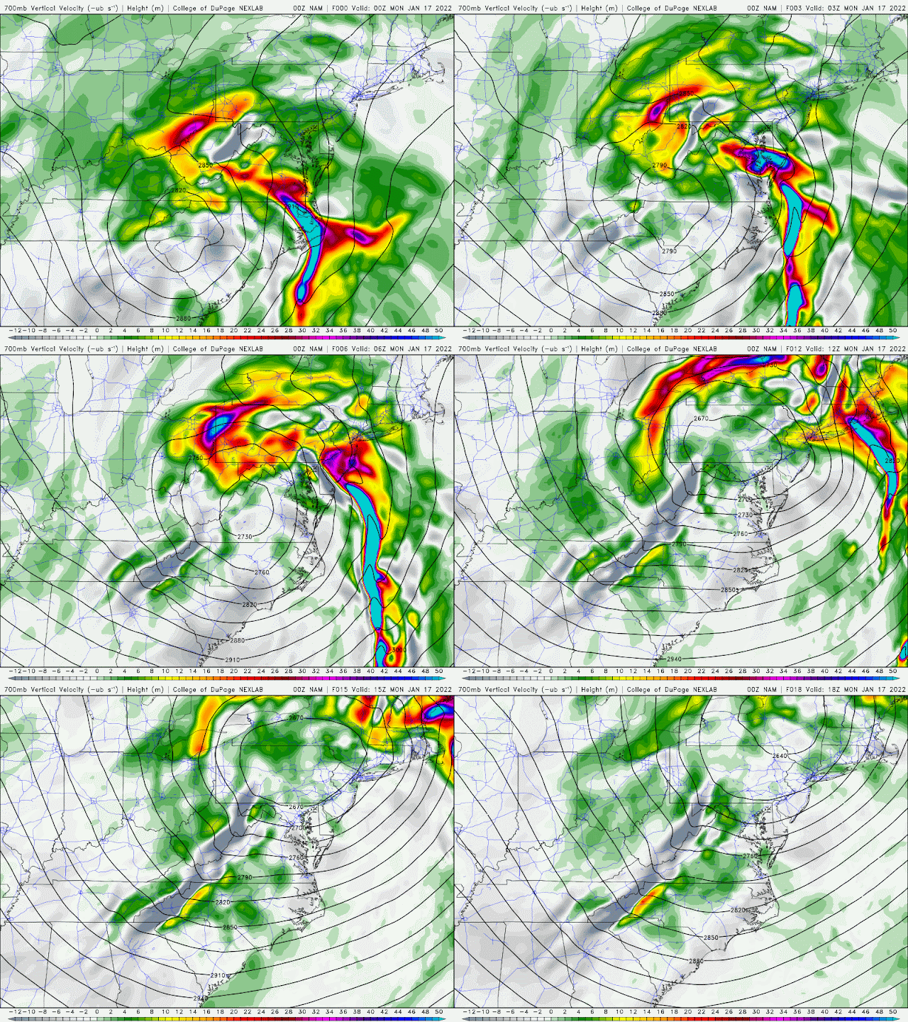
Late Sunday evening model started to show rapidly rising air (10,000 feet) on the northwestern quadrant of the parent low Sunday night/early Monday: The warmer colors along the Ohio/PA line was the catalyst for the heavier snow burst overnight. Watch the warmer colors spinning around low. This greatly contributed to the 4-5 hour window of snowfall rates of 1-2" per hour!


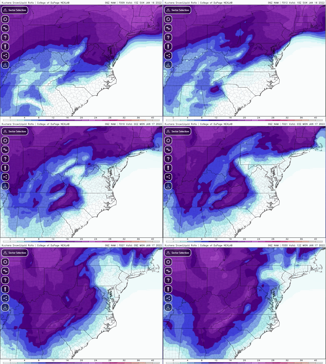
Snowfall ratios changed throughout the event. The traditional snowfall ratio of 1 inch or water to 10 inches of snowfall doesn't always work. Sunday evening/night/Monday morning, the ratio went from 6-8:1 Sunday evening/early overnight to 10-12:1 Sunday late night/early Monday morning then 12-15:1 Monday morning.  Snow type went from wet snow/sleet to heavier snow then fluffy snowfall.


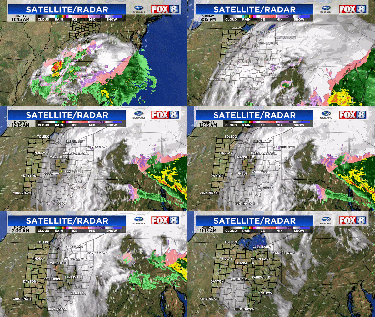
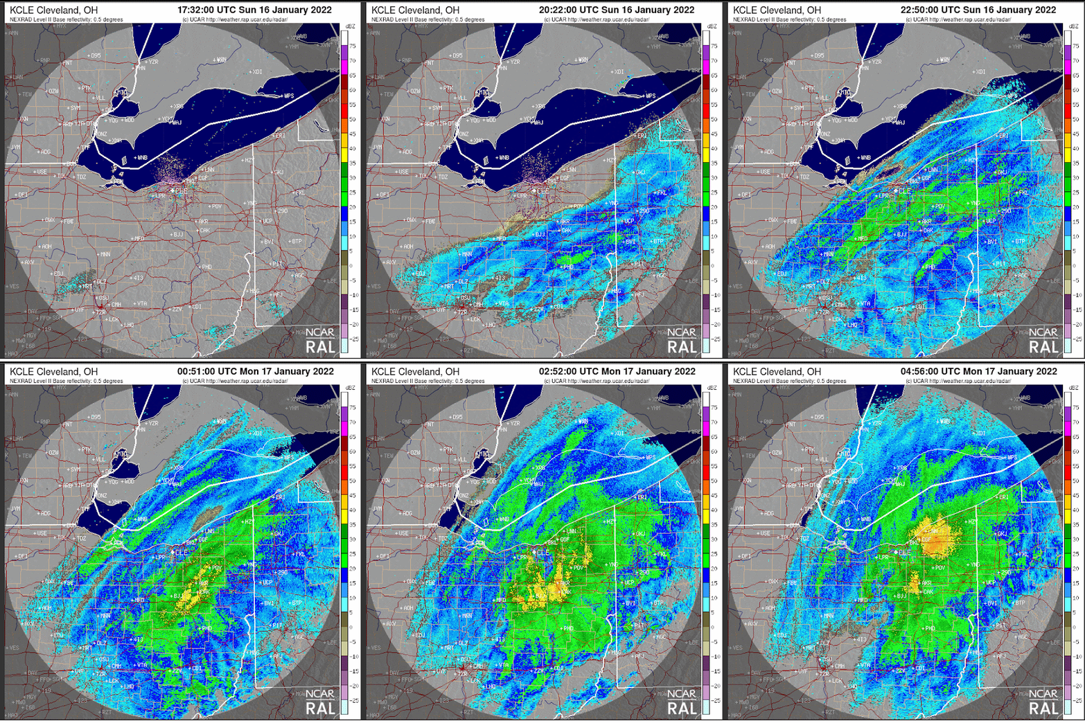
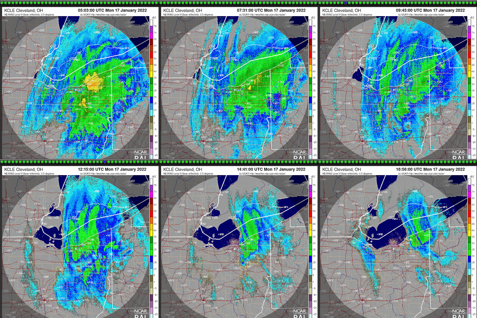
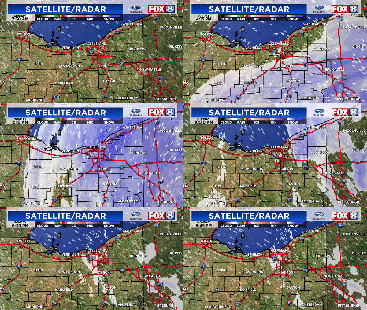
The result was this radar trend between Sunday afternoon and midday Monday.


Base reflectivity radar loop from late Sunday afternoon to midnight Monday January 17


Base reflectivity radar loop from midnight to noon Monday January 17


Composite local radar from early Sunday through Monday afternoon:


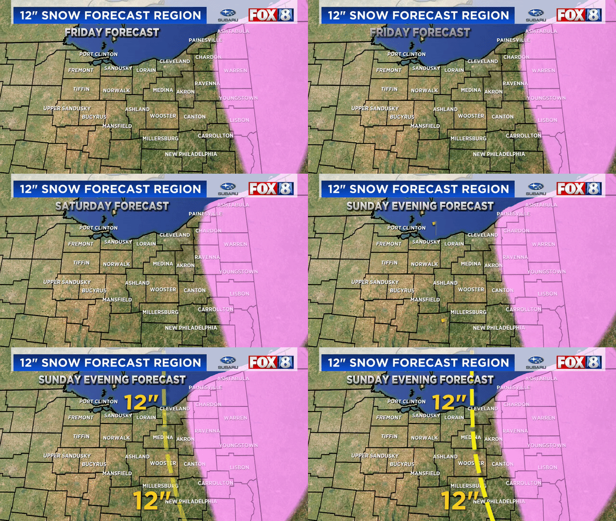
Again, our 12 inch snowfall forecast cut-off was shifted west slowly each day. The actual 12" amounts verified west by about 20 miles west of our final forecast


Overall snowfall totals from Friday through Monday. (some numbers might be too low as this is a compiled map from previous reports)


After every big weather event, its easy to Monday morning quarterback snowfall forecasts. I do it too. After forecast snow events for more than 25 years, I've seen computer models blow up snowfall amounts (once more than 35" across half of the state) only to back off at the last minute. I've been burned when trusting models verbatim many times. So here are some pointers for everyone and future forecasters:

*  Models are only ONE forecasting tool not Gospel. Don't use model trends verbatim.
*  Weather forecasting has and will always have a human element
*  Using a blend of models or a trend model forecast doesn't mean the forecast will be more accurate
*  Use history as a guide but not the only guide
*  Take into account how the public will perceive your forecast knowing you'll need to augment it

How about some common questions and comments: 

QUESTION:  "So why didn't up the snowfall forecast to reflect the changes in the models?"

ANSWER:   As said earlier, forecasts are not made solely by model output. Should more adjustments have been made toward high amounts further west? In retrospect perhaps. Some changes were made Sunday evening. Remember that this rarely happens here. SEE MY POST HERE

STATEMENT:  "Models predict snowfall.  Models predict rainfall. This seems easy."

RESPONSE:  Hardly.  Models don't forecast snowfall specifically, they forecast liquid precipitation then translate it to snowfall using a ratio (often times 10 to 1 but not always). All snow events are not a continuous 10:1 or ratio. The ratio changes over time. The trick is determining what the ratio is and how long/intense the snow.

COMMENT:  "We weren't under a winter weather advisory on Saturday yet we got 5-10" of snow Monday. We weren't prepared for this!"

RESPONSE:  I disagree. The seeds of this stormy pattern were showing up around Christmas.  We started mentioning the high potential for snowfall 5-6 days before the event. Initial snowfall forecasts were made early Saturday.  Adjustments were made Sunday morning as advisories then warnings were issued for western counties"

COMMENT: "I had 5 inches of snow in my backyard yet my county was under a warning. Wasn't that overkill?"

RESPONSE:  Back on Friday we mentioned that their would be a sharp cutoff west to east between super heavy snow and less amounts due to the position of the storm.  Eastern half of many counties received 12"+ while the western parts received half of these numbers.  Advisories and warnings are issued on a county basis knowing that local snowfall amounts will vary over short distances.  

REMEMBER: Weather doesn't stop for county lines.

COMMENT:  "I saw the storm strengthening in Virginia. You should have predicted more snow."

RESPONSE: "Strengthening storm systems hundreds of miles away DOES NOT necessarily translate to more snow in northern Ohio"

QUESTION:  "What have you learned from this snowstorm?"

RESPONSE:  "Great question. I am studying all aspects of the storm and the conditions that were present in an effort to better forecast the next one. I've also realized that people will react to snowfall forecasts differently depending on how they experience the snow (psychology and perceptions).  As communicators of weather information especially snow, we're damned if you do; damned if you don't."
"Snowfall forecasting especially with major snow storms are multifaceted and highly nuanced and never made in a vacuum. Adjustments were made by ALL meteorologist both on TV and within the National Weather Service as the situation developed. If we would have posted 16-25" initially people would have said we were crying wolf if it didn't work out. I've seen it a hundred times."


Friday, April 24, 2020

Progression of April Cold

After an extremely mild winter, the pattern across the North American continent shifted significantly colder around the second week of April. 

Remember that April started off above normal across the eastern US. The first 9 days of April the average high temperaure was close to 60 degrees in northern Ohio! We reached 72 on April 7th.  Slowly colder air settled in especially across a large portion of the country. Each graphic below illustrates the gradual progression of the cold (above/below normal temperatures) in 20,15,10,7,5,3,1 day periods prior to April 15th. The last graphic is the 5 day period from April 15-20th.

20 day temperature anomalies - 20 days leading up to April 15
15 day temperature anomalies - 20 days leading up to April 15

10 day temperature anomalies - 20 days leading up to April 15

7 day temperature anomalies - 20 days leading up to April 15th

5 day temperature anomalies - 20 days leading up to April 15th
3 day temperature anomalies - 20 days leading up to April 15th
1 day temperature anomalies - 20 days leading up to April 15th

5 day temperature anomalies - 20 days leading up to April 20th

Why these early spring changes? Let's go back to the winter for a moment. The pattern was dominantly mild. There was no "blocking" over Greenland.  The Arctic Oscillation stayed STRONGLY positive. The Polar Vortex was strong with no big perturbations south. 

The next three slides are the 500mB heights for each month January through March 26th.  High pressure over the northern Pacific. SE ridge across the US. Low pressure over the poles/North Atlantic.


By the last week of March, notice the changes. The northern Pacific high shifted west. A strong ridge developed in the North Atlantic! The SE ridge from March was still intact.
These pressure changes were a significant sign that April would more than likely feature some significant changes in areas that were used to above normal temperatures especially the eastern US and possibly the Great Lakes. (April 5th I posted a tweet noting that the next 10-14 days would feature some cold air/below normal temperatures) 

By the first week of April, the ridge across the eastern US was breaking down. High latitude blocking was present.

Between April 6 and 10, the high started to pop back in the southern states. Northern Pacific ridge was far weaker. The trough in New England was building in response to the blocking

By April 11-15th the trough/ride wavelength were much larger. The central US/eastern US trough had grown (blue colors) and was locked in.

April 16-19th featured the dominant trough across much of the US and Canada with the exception of Florida.

Watch how the colder air bled southeast throughout early/mid April in response to the upper level changes. From April 14 to the 23nd we had 5 days in the 30s and 40s with wind chills in the 20s in spots!


Is this "cold mid-April" unprecedented?  Here are some years in the past with cold mid Aprils similar to 2020. (Temperature anomalies from April 12-21 for the years 1875, 1943, 1953, 1983, 1997 and 2007 pictured below. I am sure I missed a few)


How about here in northern Ohio. Where does this cold mid April rank?  Here is the list: 2020 rank 33rd.  Also keep in mind that 32 of the 40 years listed occurred BEFORE 1960. The last year similar to this year was 2018 then 2007, 1975.


Here's a more recent analysis: Below is a graph showing the number of days with below normal temperatures through April 2nd since 1990 (last 30 years) in northern Ohio (Hopkins Airport-Cleveland). Perhaps we forgot about 2018 with MORE days below normal than 2020.


How about April snow in these years?  Great question.

This year we've had 9 day with at least a trace of snow (through April 22). Two years ago (2018) we had.....13!


So while it has been colder than normal in April, it is not unprecedented.  The recency effect is strong here as we may have placed more weight on this year because it is front of mind.

==================================================

A FEW THINGS TO NOTE:  THE COLD APRIL ISN'T A RESULT OF THE RELATIVELY MILD WINTER. SIMPLY BECAUSE THE WINTER WAS "MILD" DOESN'T AUTOMATICALLY MEAN APRIL WAS GOING TO BE COLDER THAN NORMAL. ALSO, THE GLOBAL/CONTINENTAL DRIVERS OF WEATHER PATTERNS IN WINTER CAN PRODUCE DIFFERENT TEMPERATURES, ETC IN SPRING AND SUMMER. THIS IS NOT CONFIRMATION OF "GLOBAL COOLING". IN FACT ONLY A SMALL PERCENTAGE OF THE WORLD HAS HAD TEMPERATURES BELOW NORMAL THIS MONTH.